
How to use Power BI | Beginner Tutorial in 2022
Every company has Data. All they need a good business analytical tool, which can help them visualize that and Power BI is one of the best data analytical tools currently in the industry. And I will be showing you how you can use your data set and build beautiful charts such as this one in such an easy manner and Power BI has a built in AI feature that helps you build charts in such less time. Alright, without wasting any time. Let's get started.
Step number one, we need the data set and Microsoft has provided the free data set on their website. I will put the link in the description below so that you can download the data set directly from their website. Once you have your data set downloaded. All you need to do is just click on Get Data Click on Excel workbook and select your Excel file and click on Load.
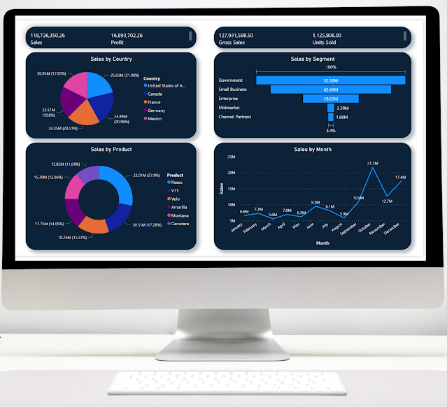
Once your file is loaded onto Power BI you will see these two sections fields and visualizations. Under fields you will see all the columns that you have. And the symbol icons are the number of data types and we will be building the charts based on these fields. Alright, let's get started. The first thing that you need to do is just double click anywhere on the chart. You will get this option over here in this just type sales by country. So over here we will be comparing the sales by country by date by product and by segment. Once you type this it will automatically give you a chart what we want as a pie chart. So we will type in pie and just select this option. Now let's arrange the chart. Let's stretch and just click on this so that it loads the chart for you. Alright, let's put it right over here.
And let's create another chart. Now. Just double click anywhere on the screen. And now what we want to do is we want the sales by segment and this time instead of a pie chart we will use the funnel chart. So just try sales by segment in funnel and select this and you will get your from chart it's so simple guides. Now just click this icon and you will get your funnel chart. Let's create another chart. And this time we will create a chart based on the sales by the product. And so just like sales by product and this time we will create a donut chart. So just select this and press this icon and it has turned this into a visual for us. So this is a pie chart. This is a donut chart and this is a funnel chart. Now let's create one more chart. And this time let's create a line chart. In the next one we want to visualize the data where you are comparing the sales by month. So just type sales by month in line and just select us it will automatically give you a line chart. Now let's just arrange these charts accordingly so that they are properly aligned to each other. Alright, perfect.
Now what we want to do is we want to have some specific numbers like what for the sales what are the profits for the company? So just double click anywhere and just tie sales by profit and press enter and you will get your exact numbers. Just click on this icon so that it turns it into a visual and just align the chart accordingly with your dashboard. Now let's create one last chart and this time let's find the gross sales by the number of units sold and just drag that and it will automatically give you that just turn this into a visual and align the chart accordingly. Alright, perfect. So now we have created our charts. In the next step we will start customizing this chart. So just select the first chart which is sales by country and over here we will work in the visualization section. This is where we will be customizing our chart. So just select the second option over here. Now what we want to do is we want to change the background of this to a different color. So just click on background. Now we have vital color. I would like this blue. All right. Once you have done that, just select all the other charts one by one and let's change the background color.
So you have selected the second chart. Just go to background. Change the color from white to blue. Let's select the third chart. Let's change the background to the specific color. Let's do the same for the both charter we do for us. Let's change it to blue. And let's do the same thing for the above two charts as well. Alright, perfect. So once you have done that, now what we want to do is we want to change the color of the text in the dashboards from this color to white. So let's select the first job now. Just click on title and change this color to white and align it in the middle. And next let's click on legend. Let's change the color to white. Let's click on detail labels. Let's change the color to white. Alright, perfect. So this chart is ready. Now let's do the same thing for the remaining charts. So let's select the second chart. Let's change under the Data Labels.
Let's change the color to white let's change the category color to white. And let's change the title to white and let's align it in the middle. Alright, perfect. Now let's do the same thing for the remaining four charts. So for the third one, I'm going to go to legend and I want to change the color to white. And same thing for data labels. Same thing for title and I'm going to align it in the middle. And let's do the same thing for the fourth one. Alright, now let's change the color for the remaining two charts over here. So let's click on category. Let's change the color to white. Perfect. Select Data Labels change the color to white. Let's do the same thing over here. So data has been changed and the category color has been changed. Alright, perfect. Now over here if you want to remove this from the card, so just select card and show bar just turn it off. And same thing just select the next chart and the show bar just turned off. Alright, perfect. Now what we want to do is we want to customize the borders of every chart. So let's select the first chart. Let's go to border. Let's turn it on. Let's change the color from black. I'm going to select the blue color and I'm going to increase the radius to the max which is 30. And for the same way I'm going to be turning on the shadow and I will change this color from black. I'm going to change it to blue. Alright, perfect. So now if we click anywhere in the middle now our chart looks very clean. And let's do the same process for all the remaining chunks. So I'm selecting the second one. I'll just turn on the border and the shadow. Click on border. Change the color from black to blue in my case and increase the radius by default. And do the same thing for the shadow change the color from black to blue. Alright, perfect. So let me do the same process for these two charts quickly. Alright, perfect. So I've changed the borders and the radius and the shadow of these two charts. So I'll change the same thing for the above charts as well. So I'm going to select the first one and I'm going to turn on the border and the shadow and the change the color to blue. Increase the radius. Go to Chateau and change the color to blue and same process for the next one. So turn on the water, turn on the shadow. Change the color and increase the radius and same thing under the shadow just change the color to blue. Alright, perfect. So our chart has ready no let's just line it accordingly so that it looks clean. Alright, perfect. So our chart is ready. And the final thing that we're going to do is we're going to put on the labels over here. So I'm going to select the last chart and go over here and under Data Labels. I'm going to turn it on so that we see the numbers and I'm going to change the color from this to white so that we see the exact sales number by month. Alright guys perfect. So I hope you guys found value in this video. It's very simple to create the charts. Please do let us know in comments!
Below is the Real-Life Business Solutions Series Playlist: https://youtube.com/playlist?list=PLZfrv0vtCa6zF7Leb--gleUrLvCtYijUq
Sample Microsoft Dataset: https://docs.microsoft.com/en-us/power-bi/create-reports/sample-financial-download
Microsoft 365 Business Standard: https://bit.ly/3HIFYEb
Microsoft 365 Apps for Business: https://bit.ly/3FxhJHh
Microsoft 365 Business Premium: https://bit.ly/3cxp4dn
Microsoft 365 Personal: https://bit.ly/30r9pcR
Microsoft 365 Family: https://bit.ly/30w4VCl
Website: https://www.productivitycentral.ca/
✅ Subscribe now: youtube.com/channel/UCT9eERQLGlXbew8Fjyjv8Iw?sub_confirmation=1
My Favorite Youtube SEO Tool: https://www.tubebuddy.com/Productivitycentral
Download Canva: https://www.canva.com/join/ltt-wvx-fjb
⚖ As full disclosure, I use affiliate links above. Purchasing through these links gives me a small commission to support videos on this channel -- the price to you is the same.


Comments
Post a Comment